In a category defined by noise, simplicity becomes a competitive advantage.
The Challenge:
While the market rushed toward:
- automation
- AI-first messaging
- replacing human expertise
Command Zero took a different position:
Make human experts more powerful—not replace them.
That required a brand that felt:
- precise
- confident
- controlled
Not loud. Not trendy.

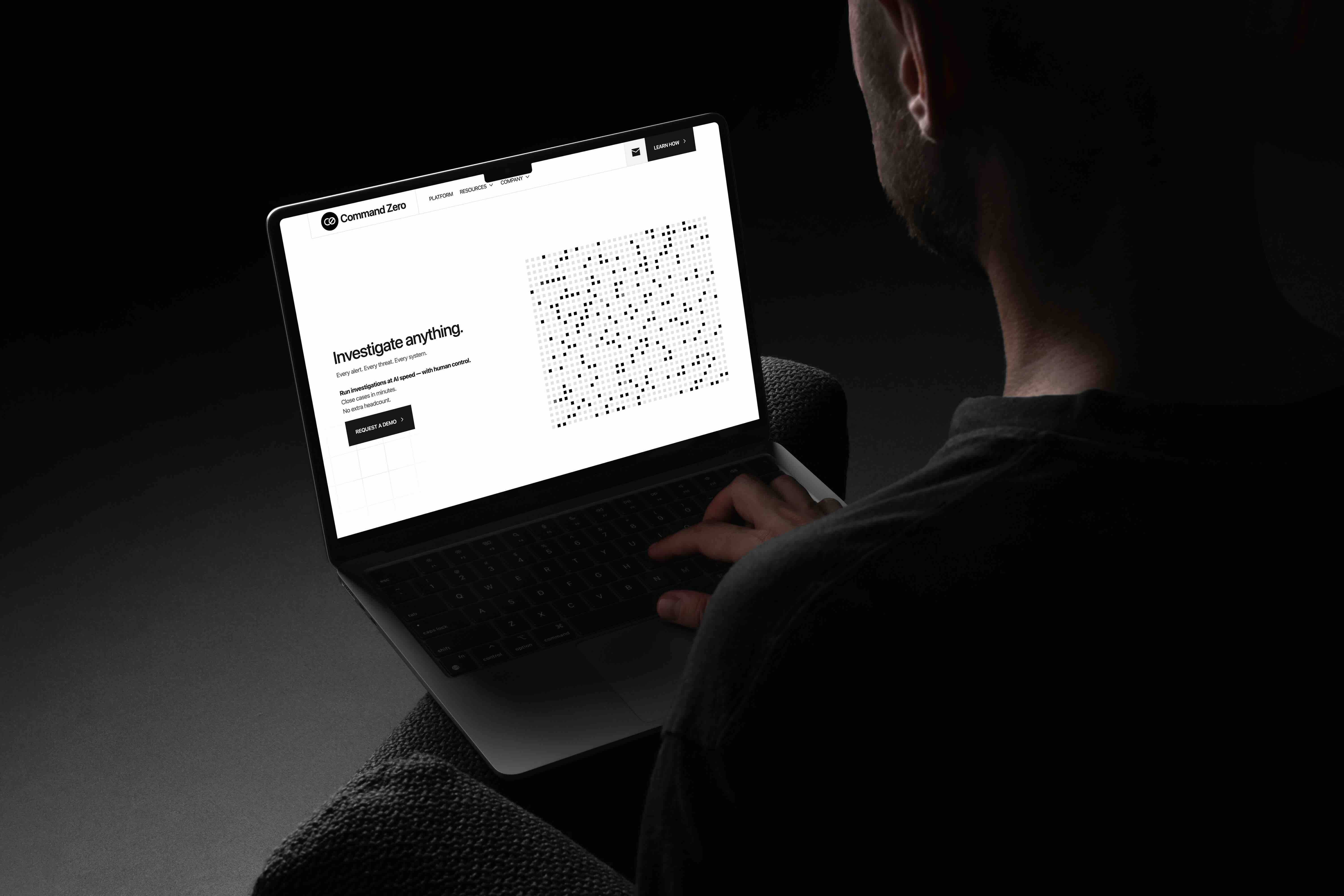
Our Solution:
Building a system, not just a brand
Working directly with the founders, I led:
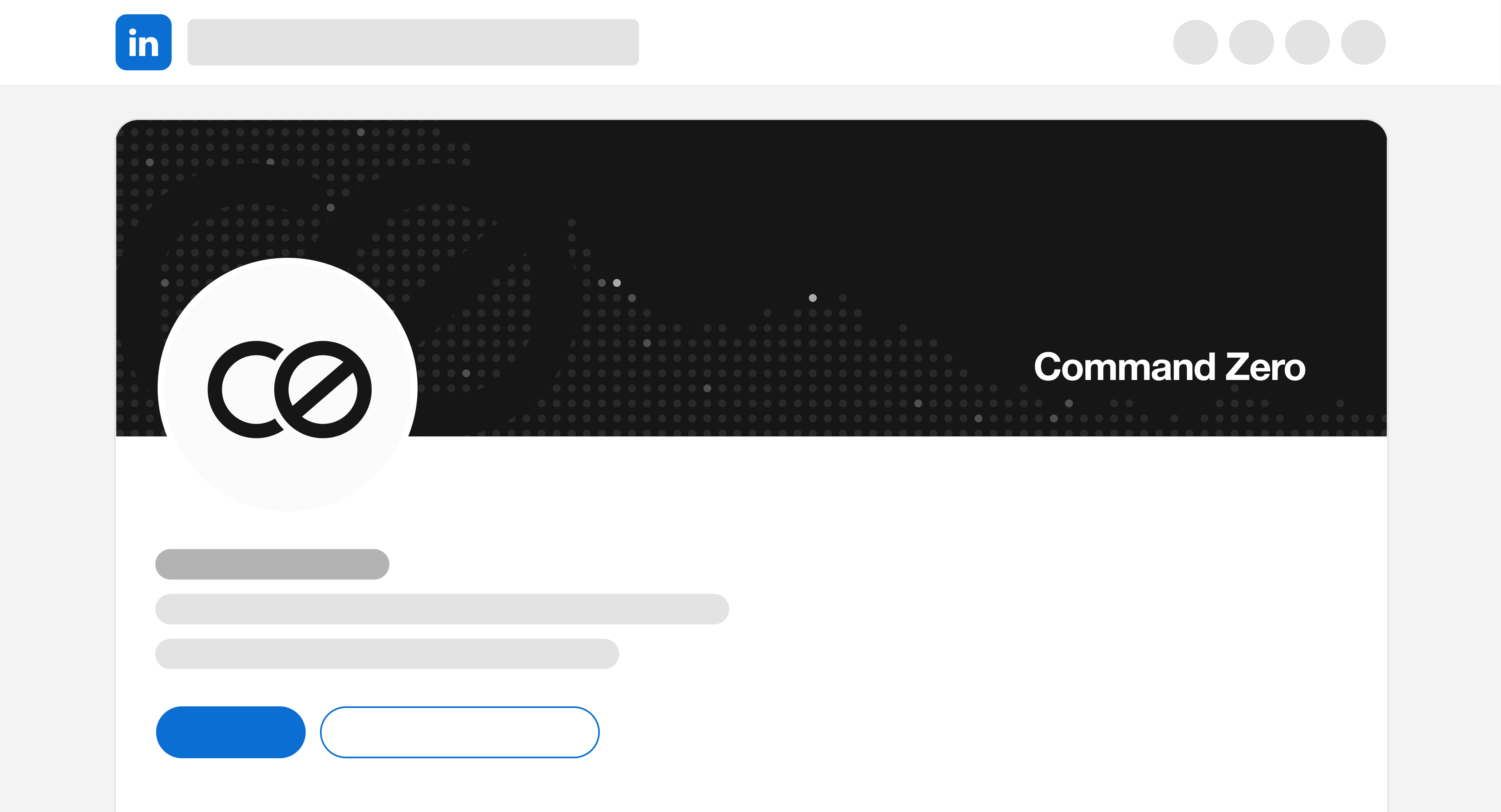
- Brand identity redesign
- Website UX and visual system
- Messaging simplification (Smart Brevity)
- Sales and marketing systems (templates, decks, assets)
Everything was designed to scale with the company.
The Results:
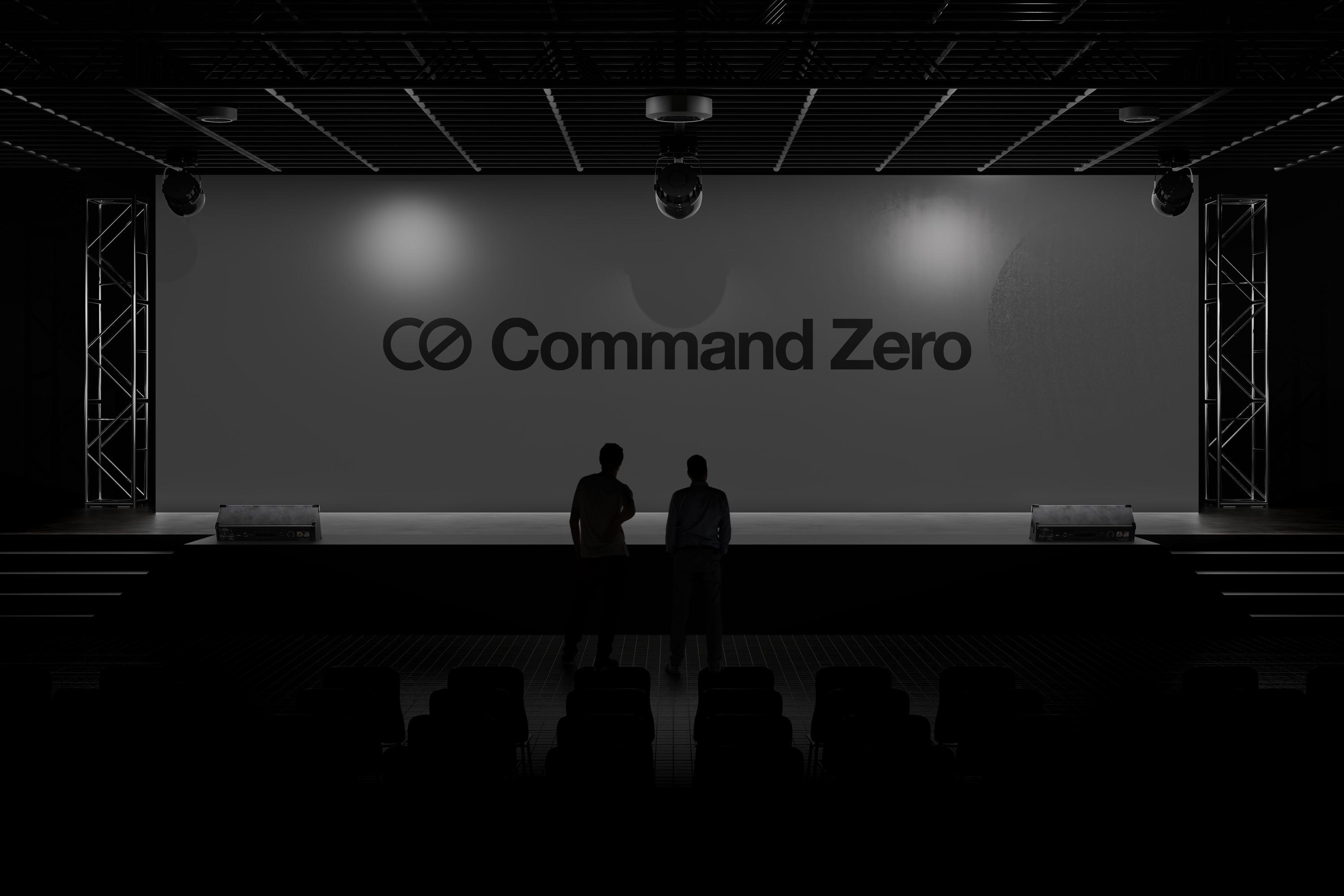
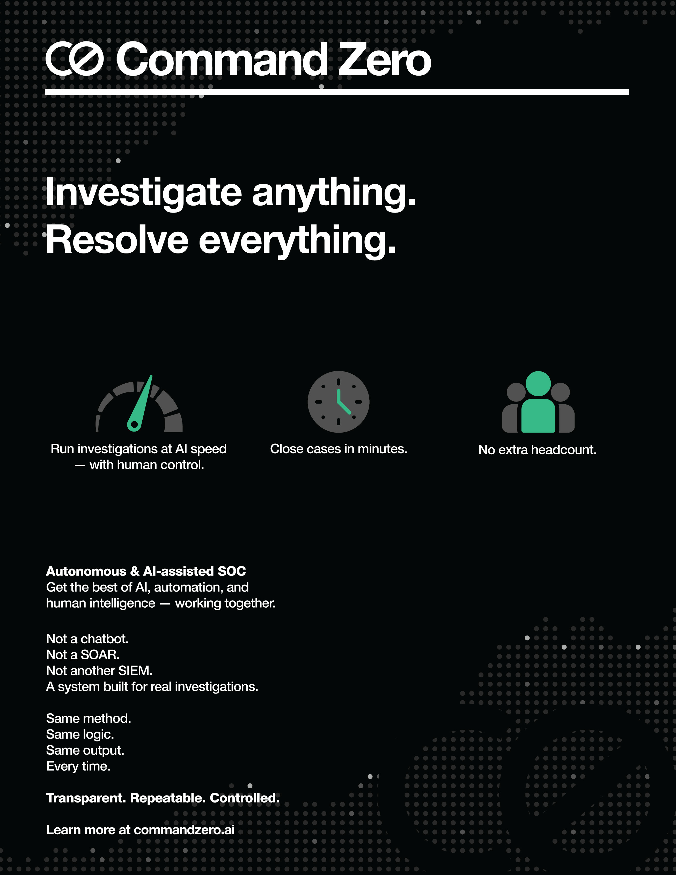
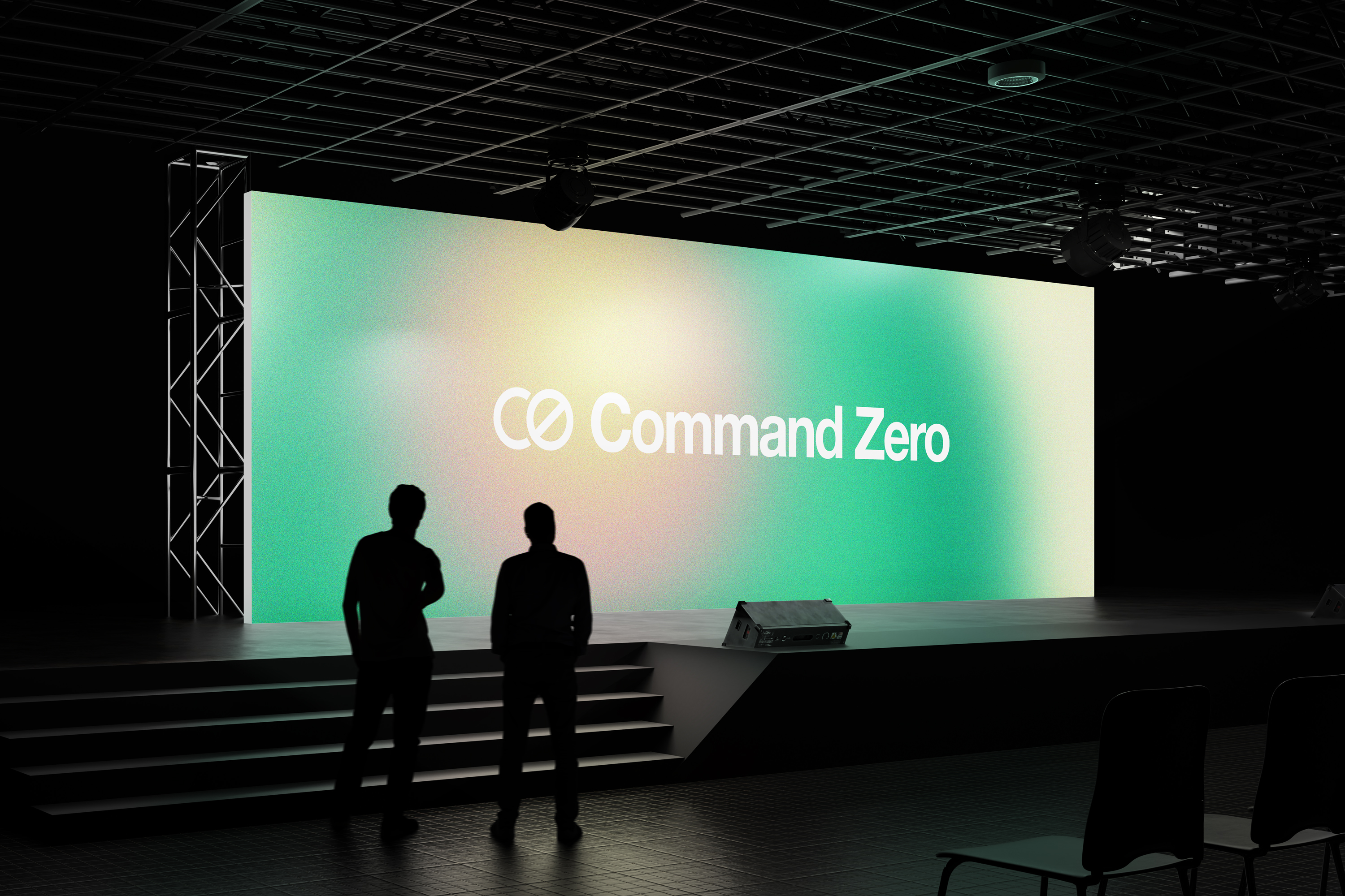
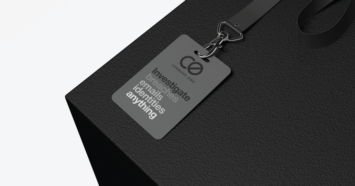
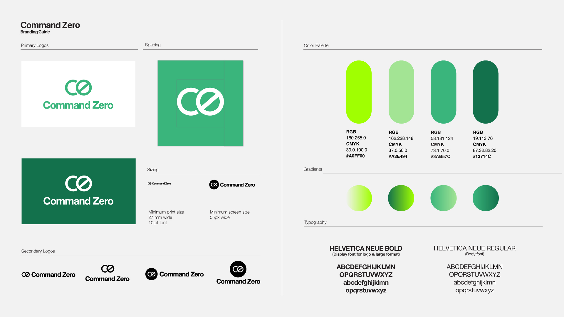
Simplicity as a signal of strength
We removed everything unnecessary.
No gradients.
No visual noise.
No “cybersecurity clichés.”
Instead:
- Black and white foundation
- Helvetica-based typography
- Structured grid system inspired by
- Minimal color (controlled use of green for emphasis)
The design doesn’t try to impress.
It communicates certainty.
In a category defined by noise,simplicity becomes a competitive advantage.