Identity
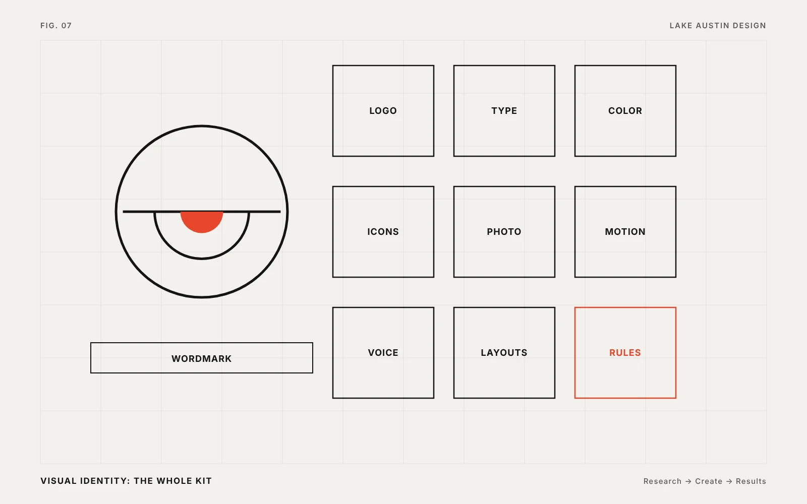
The whole kit: logo, type, color, photography and motion.
A visual identity is everything a customer sees before they read a word. Logo, type, color, photography, layout and motion. When those agree, the company looks bigger than it is. When they don’t, it looks smaller.
Command Zero: a CØ monogram, Helvetica Neue, a Swiss grid and a neutral ramp with three accent greens. It went from a blank page to the RSAC show floor in five months.
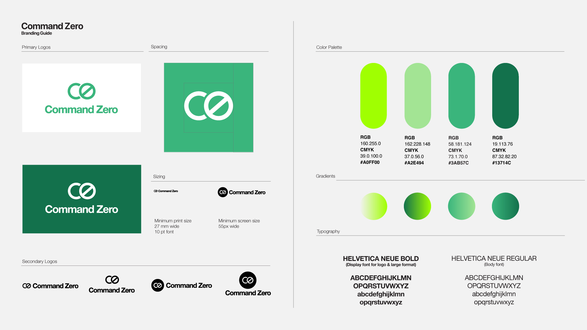
The logo is one piece. The identity is the logo plus the type, color, photography and layout rules that make everything look like one company.
Yes. Often the right move is to keep what people recognize and fix what breaks.
Part of Brand Identity Systems.